(that doesn't look like wallpaper or gift wrap)
First, I created two similar paintings with acrylic paint, on rumpled up tissue paper. I tried emulating Jackson Pollack; although I was working on a scale of 8" x 10", applying and "throwing" down different colors of paint with a small palette knife vs. a large brush. Oh, and did I mention, I am no Jackson Pollack. I was, however, successful in not flinging any paint on the couch, the cat, or my pants. A small, short-lived victory, as the old tube of gold paint then burst as I was squeezing it...Ah well, if you shout to someone to throw you some wet paper towel across the room, and you wipe up very quickly, you can get rid of most of the evidence.
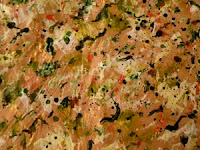
 1.) Beige tissue paper with white, green, gold, red, navy blue
- Focus: fairly spread out among similar sized, smallish smears, splatter dots of color/paint
- Texture: supplied primarily by crumpled up tissue paper underneath paint, and some paint spots.
- Colors: white, green, gold, red, navy blue (tube colors, mixed only loosely with one another via palette knife wiping/spreading together
- Results: I liked the beige tissue paper, and strange texture it offered when rumpled; however, this image looks like a pizza to me. The green paint ended up looking like guacamole. Goodness knows what the navy blue shapes would represent in a pizza; perhaps best not to think about this.
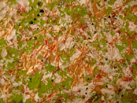
 2.) Green tissue paper with gold paint splotches/swirls
- Focus: fairly spread out among similar sized elements of color/paint
- Texture: supplied primarily by crumpled up green tissue paper underneath paint, and by gold blobs/swirls
- Colors: white, gold, red, green, navy blue (tube colors, mixed only slightly when I applied with palette knife)
- Results: Texture and pattern is OK. But, this looks too much like a pizza or wrapping paper to me. Needs more focal point(s).
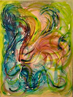
 3.) Colored Swirls with soft gel medium
 - Focus: This third image with different colored swirls had more of a focal point, or points -- or at least a design that was less static, that led your eye around -- from one area to another area.
- Texture: The texture in this third piece was supplied by soft gel - which hardened to form swirls and ridges. However, the clear gel is hard to see in a flat photographic image like what is shown here.
- Color: The colors (blues, greens, pinks) were all about the same value - tube-strength colors, diluted only with water (and not white or other colors) so they were easier to apply.
- Results: There is more of a focal point in this arrangement of similar shapes, and some texture.
- It's easy to lose sight of some important aspects of the overall design when you're very focused on being successful with individual elements, say a creating a certain texture, or limiting sizes of a field of similar sized elements.
- Multiple iterations of a single work/piece will likely be required for results I like.
- Experimenting with clear soft gel as a textural element (3rd piece/swirl painting) was fun, interesting -- although the raised areas don't really show up in a 2D photographic image (shown).
- Working bigger on abstract pieces (ones without a clear focal point or design) is better; I can always experiment with scaling things up or down, or cropping/chopping up this work if I start with a larger source area.
No comments:
Post a Comment